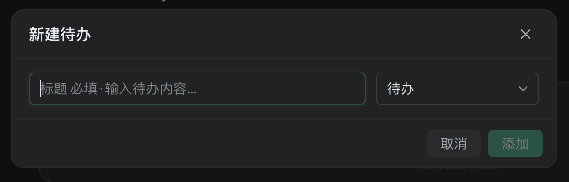
Principle: prefer Finch's native UI — don't build your own dialogs and notification shells. Native components automatically adapt to theming, dark mode, keyboard navigation, and cross-platform consistency.
Which one to use
| Need | Use |
|---|---|
| Lightweight feedback (saved, connected) | ctx.ui.showToast() |
| Yes/no confirmation (delete, irreversible action) | ctx.ui.showConfirmDialog() |
| Multiple action choices / showing information | ctx.ui.showModalDialog() |
| A user-initiated form (API key, connection config) | ctx.ui.showModalDialog({ fields }) |
| A tool mid-execution needs a missing parameter | exec.ui.requestForm() |
| A persistent Composer entry point | A ComposerAction button |
| Container-level account/connection settings | A container settings menu (see Session containers) |
| A floating widget (desktop pet, timer) | ctx.ui.createCanvasWindow() |
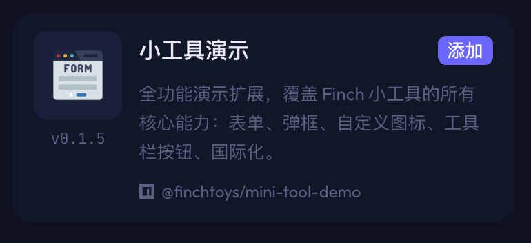
You can also explore some of these UI capabilities firsthand via the mini tool demo:
Trigger flow
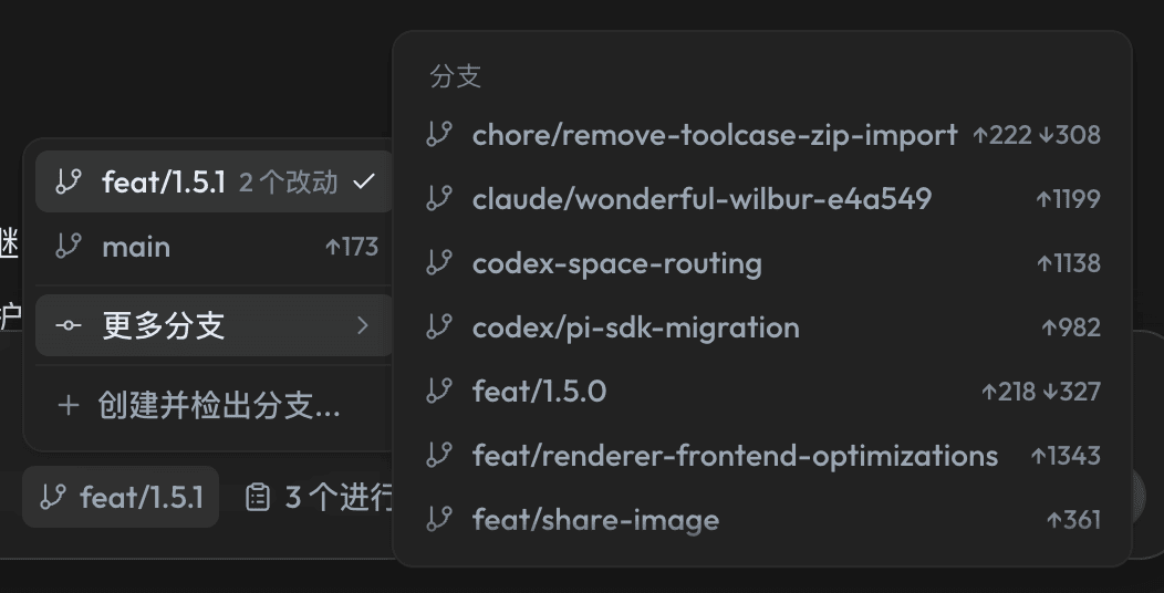
ComposerAction: composer buttons
Declare the slot in the manifest:
{
  "contributes": {
    "composerActions": [
      { "id": "git-branch", "icon": "GitBranch", "tooltip": "Switch branch" }
    ]
  }
}
Then provide the behavior in code:
const action = ctx.composerActions.register('git-branch', {
  async getBadge({ cwd }) {
    if (!cwd) throw new Error('N/A');   // Throwing hides the button
    return await getCurrentBranch(cwd); // A string becomes the badge text
  },
  async getMenu({ cwd }) {
    return (await listBranches(cwd)).map((b) => ({
      id: b, label: b, iconName: 'git-branch', hoverText: `Switch to ${b}`,
    }));
  },
  async execute({ cwd }, itemId, actions) {
    await checkout(cwd, itemId);
  },
});
ctx.subscriptions.push(action);
Four possible return values for getBadge():
| Return | Effect |
|---|---|
string | Shows badge text |
{ text?, active? } | active: true turns the button into a highlighted "on" state (accent-colored icon + background) |
undefined | Icon only |
| Throws an error | Hides the button entirely (means it doesn't apply to the current cwd) |
The badge is pulled, not refreshed on a timer. When the underlying state changes in the background, call notifyUpdate() on the registration handle:
const timer = setInterval(async () => {
  if (await stateChanged()) action.notifyUpdate();
}, 5000);
ctx.subscriptions.push({ dispose: () => clearInterval(timer) });
Keep polling intervals at 3 seconds or more. ctx.sessionId is available in the session UI, so toggle state can be scoped per-session instead of globally.
getReminder(): appends a strong reminder before every turn. Beyond badges and menus, a ComposerAction can append a system-level reminder to the model right before each message is sent, constraining how it should behave "this turn" — without needing a separate agent tool or the user typing instructions.
async getReminder({ surface, sessionId }) {
  return isEnabled(sessionId) ? REMINDER : undefined;
}
- Returning a
stringinjects that text as a reminder for this turn;undefinedappends nothing. - It's called fresh before every message, so you can return different content based on
surface(home/session) andsessionId— as a toggle, a one-shot, or a persistent per-session reminder. - The reminder is system-level text appended for the model — it never appears as a chat bubble and is never reviewed by the user, so use it carefully and avoid contradicting anything visible in the conversation.
- A canonical example is the official
plan-modemini tool's "planning mode": once the user turns it on,getReminder()returns "output a structured plan only, don't run any tools, wait for user confirmation" on every turn;onClicktoggles the button state and persists it inctx.storage; once the model produces a plan, anonTurnEndhook (fired when the model's turn ends) shows a confirmation dialog — confirming automatically turns off plan mode and fills the execution instruction into the composer viaactions.composer.fill(), forming a complete "plan first, then execute" loop.

Menus
Menu items are returned dynamically by getMenu(), called fresh every time the menu opens.
[
  { id: 'status', label: 'Connection status', description: 'Signed in',
    iconName: 'toggle-right', disabled: true },
  { id: 'divider', label: '', separator: true },
  { id: 'logout', label: 'Sign out', iconName: 'log-in' },
]
Four rules:
- Every clickable item must have an
iconName, and it must be either a built-in Finch icon id or a registeredext:SVG. An icon id that doesn't exist silently renders as plain text, with no warning — this is the single most common pitfall. Check the built-in icon list before setting anyiconfield — see Icon guidelines. - Status displays aren't actions. Show state with a
disabled: truerow; use a separate clickable row for login/logout. separator: trueis its own item, not a property of the next row.- Use
hoverTextfor long descriptions (plain text, preserves line breaks, no Markdown) — don't stuff them intolabel.
Modals
const result = await ctx.ui.showModalDialog({
  title: 'Choose an action',
  message: 'There are 3 unsynced records.',
  actions: [
    { id: 'cancel', label: 'Cancel' },
    { id: 'sync', label: 'Sync now', variant: 'primary' },
  ],
});
if (result.action === 'sync') { /* ... */ }
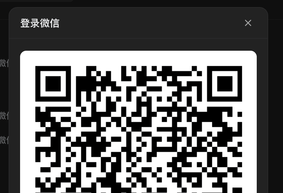
message supports lightweight structured text: blank lines, inline code, emphasis, dimmed/warning lines, and a standalone Markdown image  — useful for something like a login QR code. Image sources must be either credential-free https:// URLs or base64 data URLs under 5MB, and only ever render in the UI layer — they never enter the tool result or the model's context.
The returned handle supports programmatic closing, typically used for QR-code login:
const dialog = ctx.ui.showModalDialog({
title: 'Scan to log in',
message: `Open the app and scan the QR code below.\n\n`,
actions: [{ id: 'close', label: 'Close' }],
});
// Close it proactively once background polling confirms login
await dialog.close('connected');
const result = await dialog; // { action: 'connected' }
Forms
Two APIs render the exact same field grid. Field types are text / password / textarea / number / select / boolean / link, supporting required, secret, width, default, and options.
The choice isn't about appearance — it's about when input is needed:
exec.ui.requestForm(spec) | ctx.ui.showModalDialog({ fields }) | |
|---|---|---|
| Called from | Only inside a tool's execute() | Anywhere — a button callback, a settings menu, even activate() |
| Requires a model turn | Yes, only while the model is calling your tool | No |
| Renders where | A card in the Composer's waiting area | A native modal, with custom buttons |
| Best for | The model is mid-execution and missing a parameter | The user proactively opens settings to enter an API key |
const result = await ctx.ui.showModalDialog({
  title: 'Configure API key',
  actions: [
    { id: 'cancel', label: 'Cancel' },
    { id: 'save', label: 'Save', variant: 'primary' },
  ],
  fields: [
    { key: 'apiKey', label: 'API key', type: 'password', secret: true, required: true },
  ],
});
if (result.action === 'save') {
  await ctx.secrets.set('apiKey', String(result.values?.apiKey ?? ''));
}
When fields is present, the first variant: 'primary' button stays disabled until required fields are filled in. Values from secret: true fields are never sent back to the model — store them with ctx.secrets, never in the tool result.